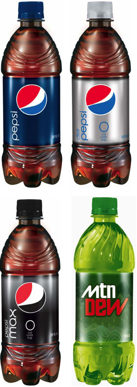
Pepsi has, apparently, rebranded. This is a version of their old logo. What do you think?
In my design classes in college, we'd mock up designs like this - clean, modern, and usually unworkable in a world where packaging has to include color tests, nutrition info, copyright, contact info, sales promos, etc. The old, busy design could accomodate the weight of this information. The newer, cleaner design will look set upon by those additions. That said, it will provide more contrast for yellow ribbon sales promos that often ring the top of these labels.
3 comments:
I don't know - the shifting size of the white part of the logo doesn't make me think of caffeine levels, it makes me think of a guy with an expanding beer (or in this case, soda) gut.
Not my favorite design either... I think the minimalist look is better suited for living room furniture and magazines... do we need this on our cereal boxes and bread packages too? That is probably already coming....
I think the more important aspect is that diet pepsi is nasty, especially when compared to diet coke.
I dont mind the alter to the swoosh balls (heh, swoosh balls)
But I dont know that i get why there needs to be a difference in balls from subbrand to subbrand...
And though clean, I don't love the typography... It kinda works for Pepsi Max, but other than that i'm lost... On the rest, it just looks more like a bottle of vitamin water or something
Pepsi is a big, loud, unapologetically boisterous brand... this feels a bit too restrained to me.
Post a Comment