There is a revolution in design going on and I love it. Some of the applications and services I use most, Gmail, Calendar, Amazon, Blogger, etc. have launched simpler, cleaner interfaces that strip away the 'bubble gum' in their interfaces in favor of subtlety. It's like I traded in my 1980's 'future-cool' plastics for the warm teaks of Scandinavian design.
The thing that prompted the post was news of the new Windows 8 taskbar design. Look at that. No huge lists of stuff. Just settings, search, and thats...like ... it.
Check out the new gmail:
And calendar
And Blogger
And even Amazon...I mean to you remember how cluttered it used to be?
Need a reminder? Here's the previous version:
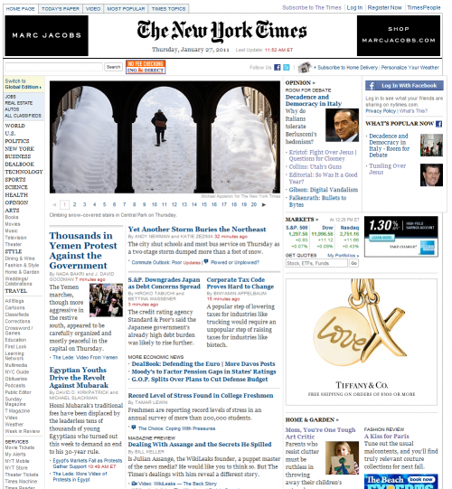
Look, I am sure we'll get back to world of clutter. Indeed, I think this just counterbalances the clutter we're seeing in our ad-supported content sites. To wit:
And NYTimes
Keep in mind that that's simplified from what we used to have as well. Anywho...I can enjoy my cleaner, clearer world for at least a little while.


1 comment:
On a related note, several of the companies you named have a significant investment in tablet machines.
Post a Comment